Designer / Creative Director
Work
About
Contact
Shop
0
Designer / Creative Director
Work
About
Contact
Shop
0
Work
Creative direction + design
Twitter Culture
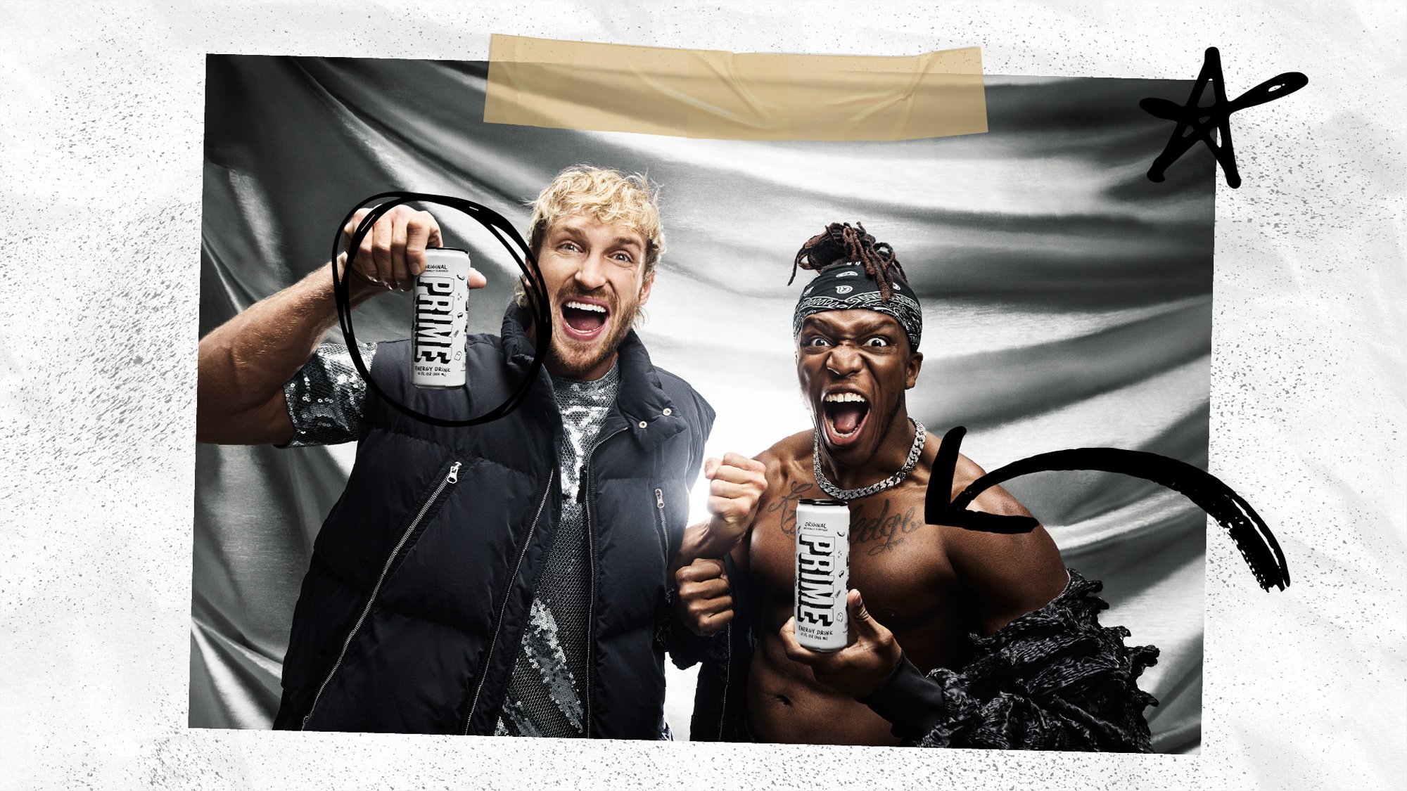
PRIME
Logos
Twitter Icons
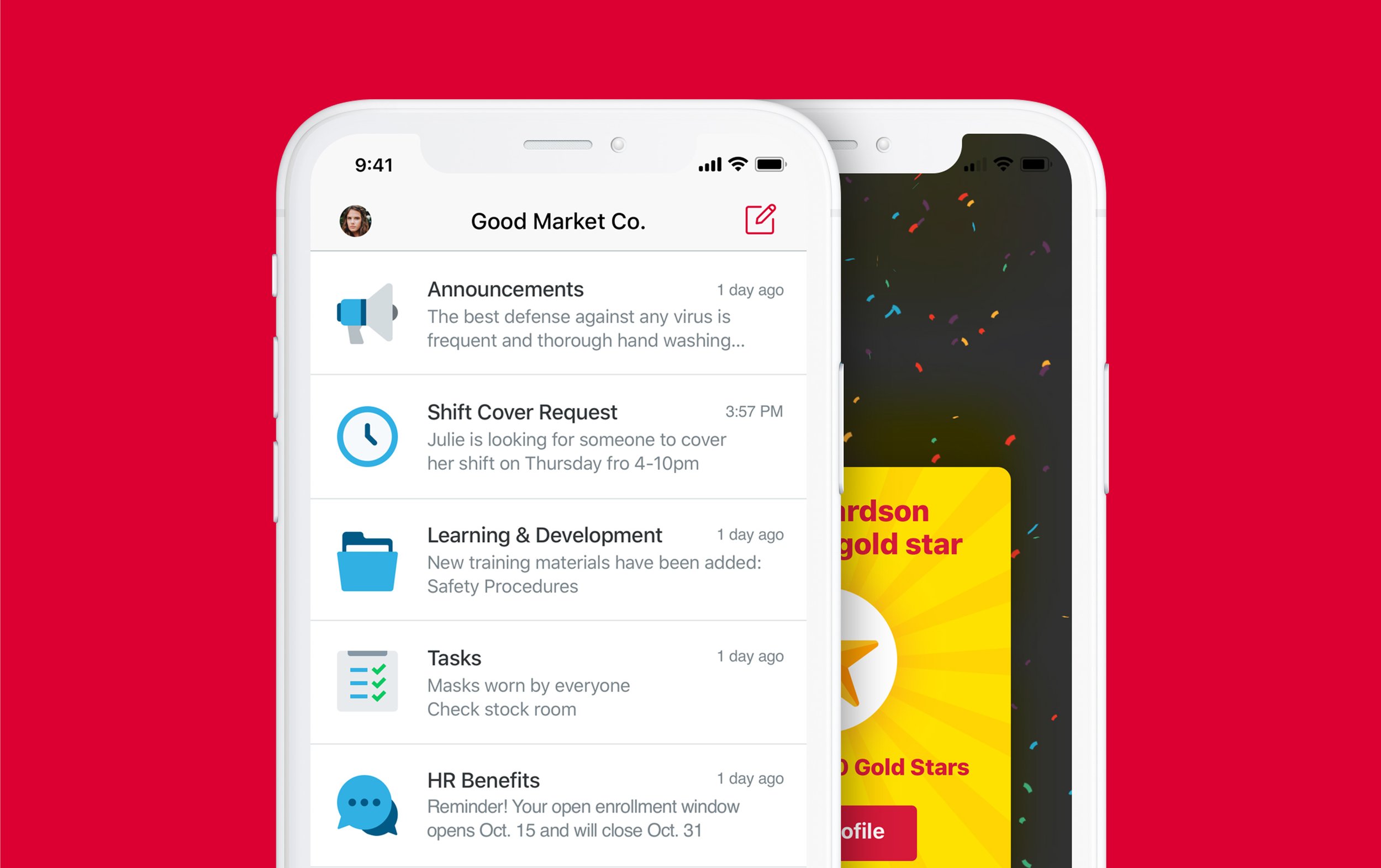
Crew App
Diamond Dictionary
Geek Squad
Twitter Emoji
Flying Axes
Join the Flock Wine
Twitter Design Yearbook
LEO Weekly
Louisville Graphic Design Association
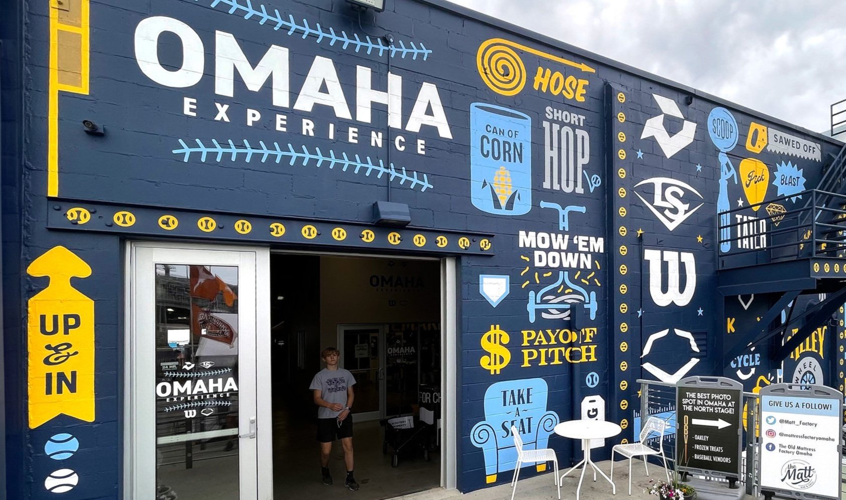
Louisville Slugger Ads
Filson Historical Society